June 2022
One of the under-appreciated benefits of creating a new product is the opportunity to keep things simple. Clean engineering architecture. Focused design. Simple user experience.
The obvious challenge is that complexity is naturally introduced as customers and colleagues demand more of products. For a team with aggressive deadlines, it’s easier to jam another layer on top of an existing product (at the expense of a clean user experience).
Larger ‘version’ updates can pay back user experience debt. At NASA we’d deliver a new flight software version to unlock new and first-class functionality. At all startups I’ve worked at so far, after a period of incremental updates to a product.. same story. Iterative development is a beautiful thing, but with a big team it results in clutter that usually requires batch updates to simplify.
And it makes sense. Products start small, doing one thing well. Then you add more features. More customers. More use-cases. And the product surface area increases. Removing features burns resources, make customers unhappy, and rarely adds revenue quickly .. so pruning features is uncommon.
It’s easy to fall into this trap as a product matures. We did at Attentive.
Attentive
Attentive is the leader in SMS marketing software. Customers love the product. Attentive is an incredible company. But for many reasons and in many places in the product, the user experience became cluttered. The number of customer questions about how to use the product was staggering at times *. For the first few years, Attentive dealt with the user experience complexity by standing up a giant Customer Support team. ( * To be fair, hands-on CS support was an important feature at first. SMS marketing has a lot of legal hurdles to hire enterprise clients and drive adoption, and best-in-class customer service led to early success at Attentive).
This large CS team resulted in unique power dynamics across the organization that persisted even after we began to simplify the product’s user experience. The EPD org at times delivered frequent and urgent band-aids to save revenue. Complex products and processes influence and entrench org dynamics more than you’d expect. See: ‘you ship your org chart’. Attentive is on track to win the market, so this approach can definitely work! But it comes with a cost. A simple product experience obviates the need for such a giant CS team.
With Staffparty, I’m making some decisions now about GTM and capitalizing the business. I am focused on delivering the most simple user experience possible for both customers and users (candidates, for Staffparty Offers). Here’s an example - let’s walk through the idea maze behind one small part of Staffparty’s Offer product.
Staffparty
It takes incredible attention to detail to deliver simple user experiences.
To start, what is Staffparty Offers competing with? When most companies deliver a job offer, they send the candidate a DocuSign link that describes terms of employment. For the candidate, it’s a horrible process (lack of transparency, no connection to future teammates, artificial urgency, and more. Yuck!). However, for the hiring manager or recruiter, it’s actually not a terrible user experience. It’s basically a high-stakes but simplified word editor, which these days is a rather simple user experience. Some recruiters still fat-finger traditional offer letters, but relatively speaking it’s very easy to put together a new DocuSign offer letter from a template. Ultimately, Staffparty Offers interface is competing with these templated DocuSign experiences. So we had to make the process of creating a new offer very simple.
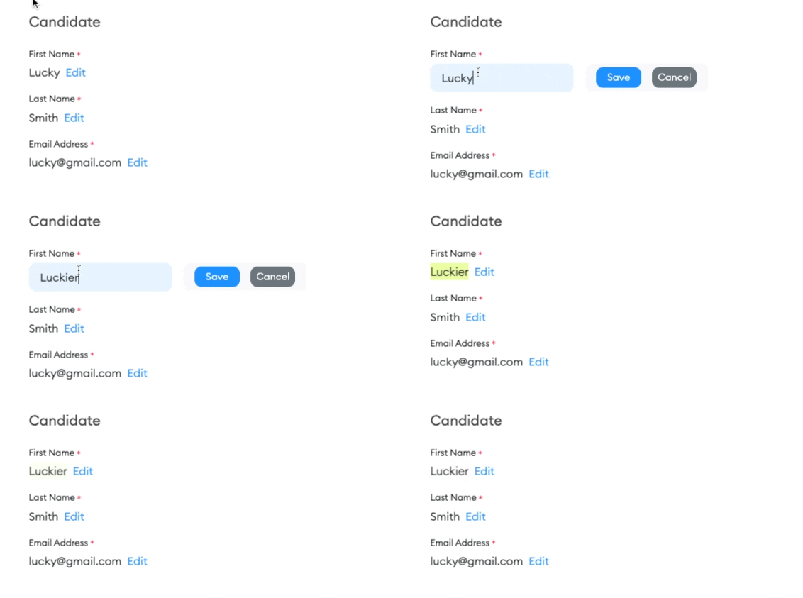
Here’s what we came up with.
Most products would just populate the page with simple input fields to edit an offer. Some modern auto-saving products might even save upon detected input field changes. We thought that was too risky. Some traditional products would introduce a ‘save’ button to save all edited fields at once. We thought this was too unfocused. Most offer editing is focused on just one or two items in the offer - out of dozens of fields. Our 2-step edit process is simple, intuitive and focused, but also discourages common mistakes. See below for a screenshot of a user (recruiter) editing the candidate's first name in a Staffparty Offer.

There are a few concepts here that are reusable:
- Delete distractions during high-stakes user actions. When editing a piece of critical information, make sure that only that particular data is in-focus.
- Delete features and user options. Every mobile game has one path towards the final boss, even if the game makes you feel like there are endless options. Focused SAAS products should do the same. Not many bells/whistles in this interface above, but it still feels friendly and playful as a result of the whitespace, colors, font and (unshown) delightful animations.
- Reduce the possibility of user errors, and make it easy for a user to recover from mistakes. Edits are displayed in realtime (<50 ms) and a content mistake is immediately obvious and easy to reverse.
Keeping a user experience simple is easiest when the product surface area is narrow and Staffparty Offers will attempt to grow in complexity over time. But the foundation is set up such that we can support many months of radical product growth without ‘versioning’.
Stepping back. I’ve spent the past week talking with customers about recruiting processes. The thing I’ve found to be most illuminating is the sheer volume of manual processes that are complex, have poor communication, but are generally accepted as ‘the way things work’. Connection points between functions are typically where the impact of these complexities show up and create chaos. There are dozens of examples, but so far I think that all of them can be solved via software that provides simple user experiences. There’s a lot to build :)